C O D I P L E S T U D I O

GNB Energy

Brand Identity Creation

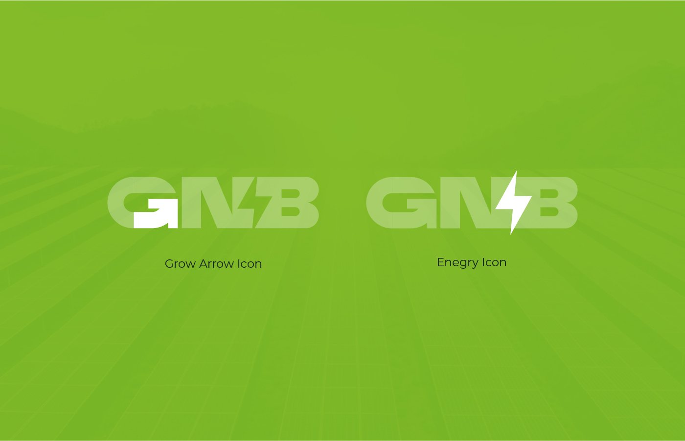
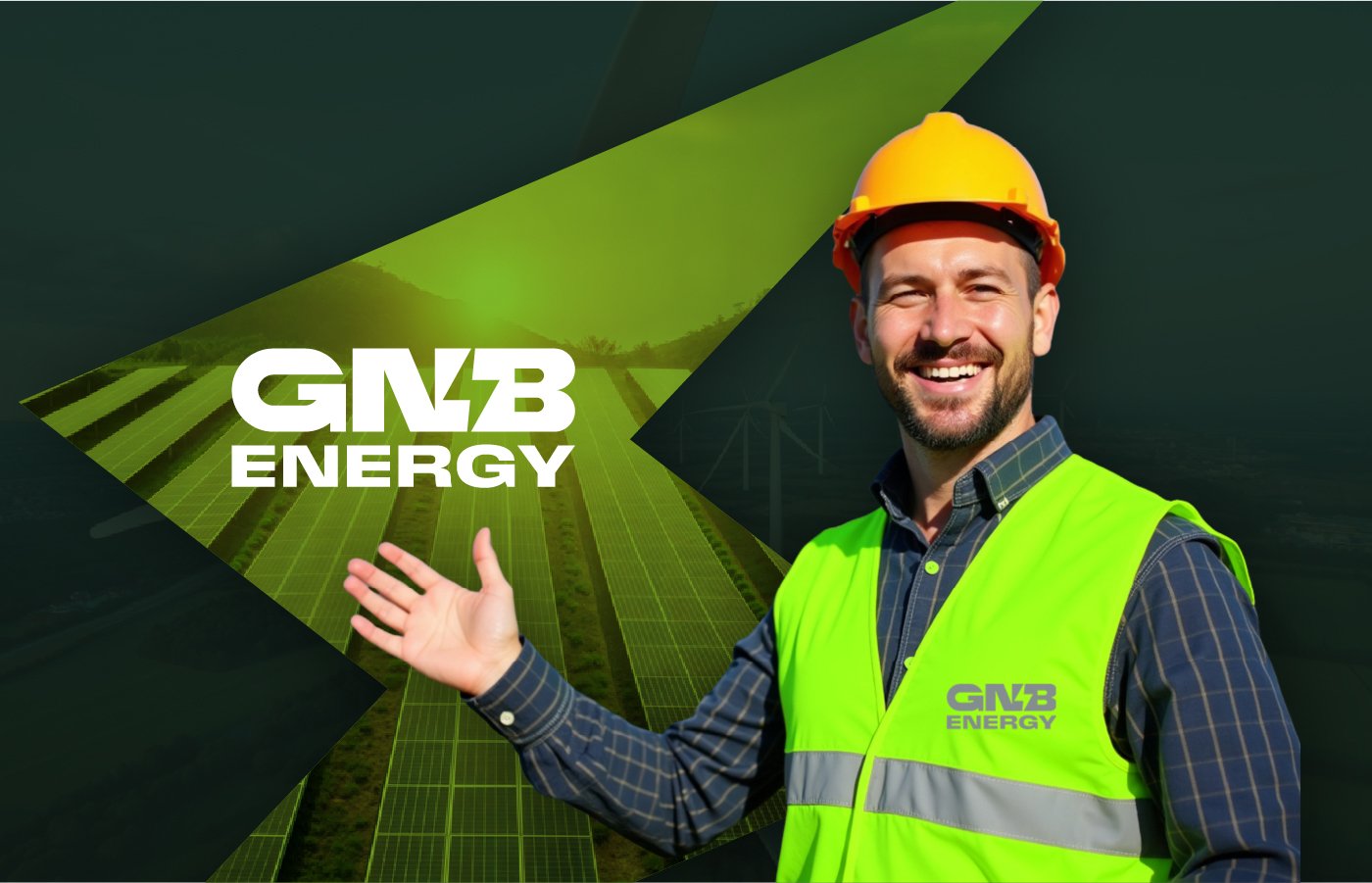
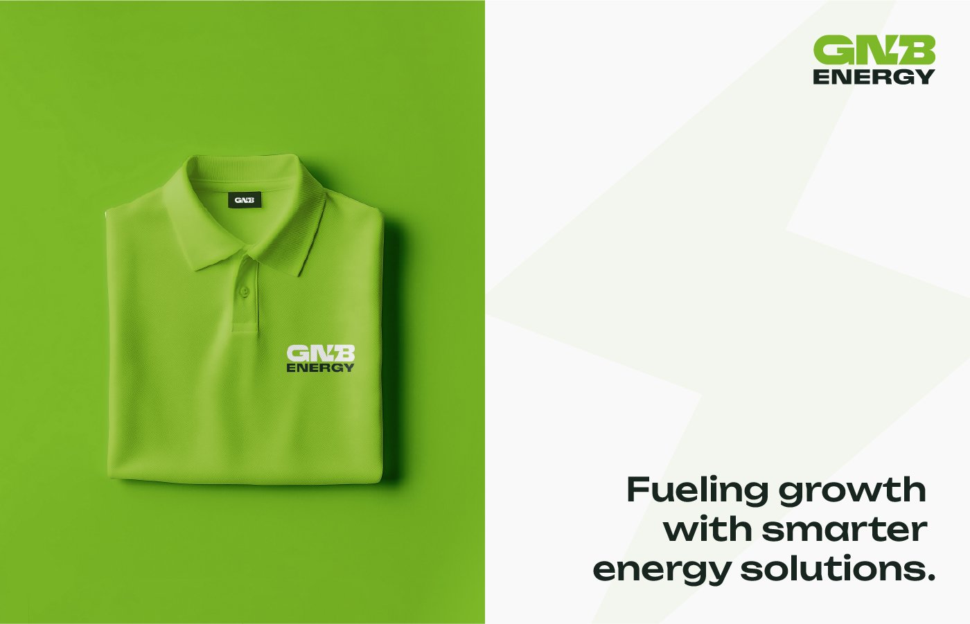
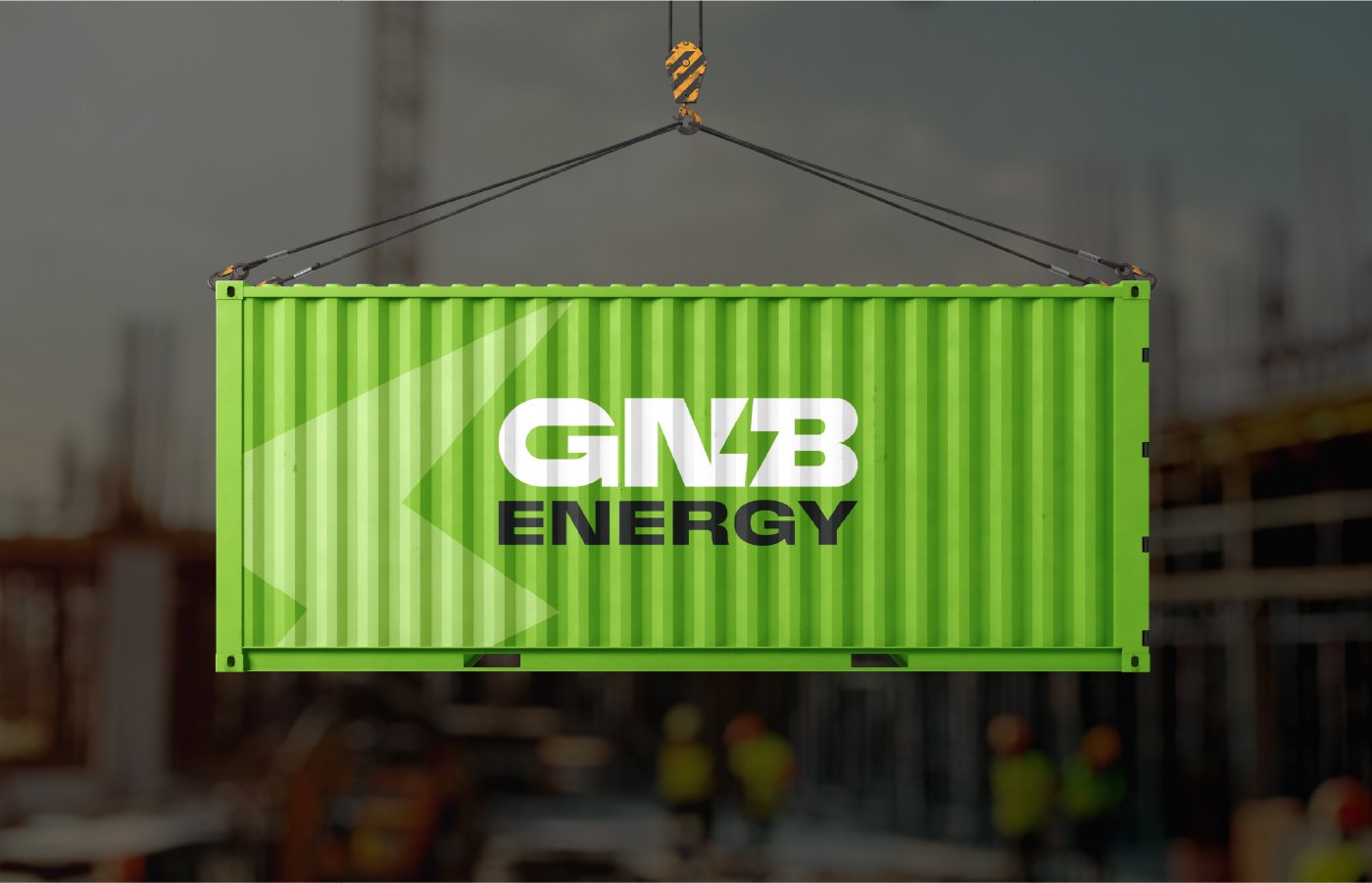
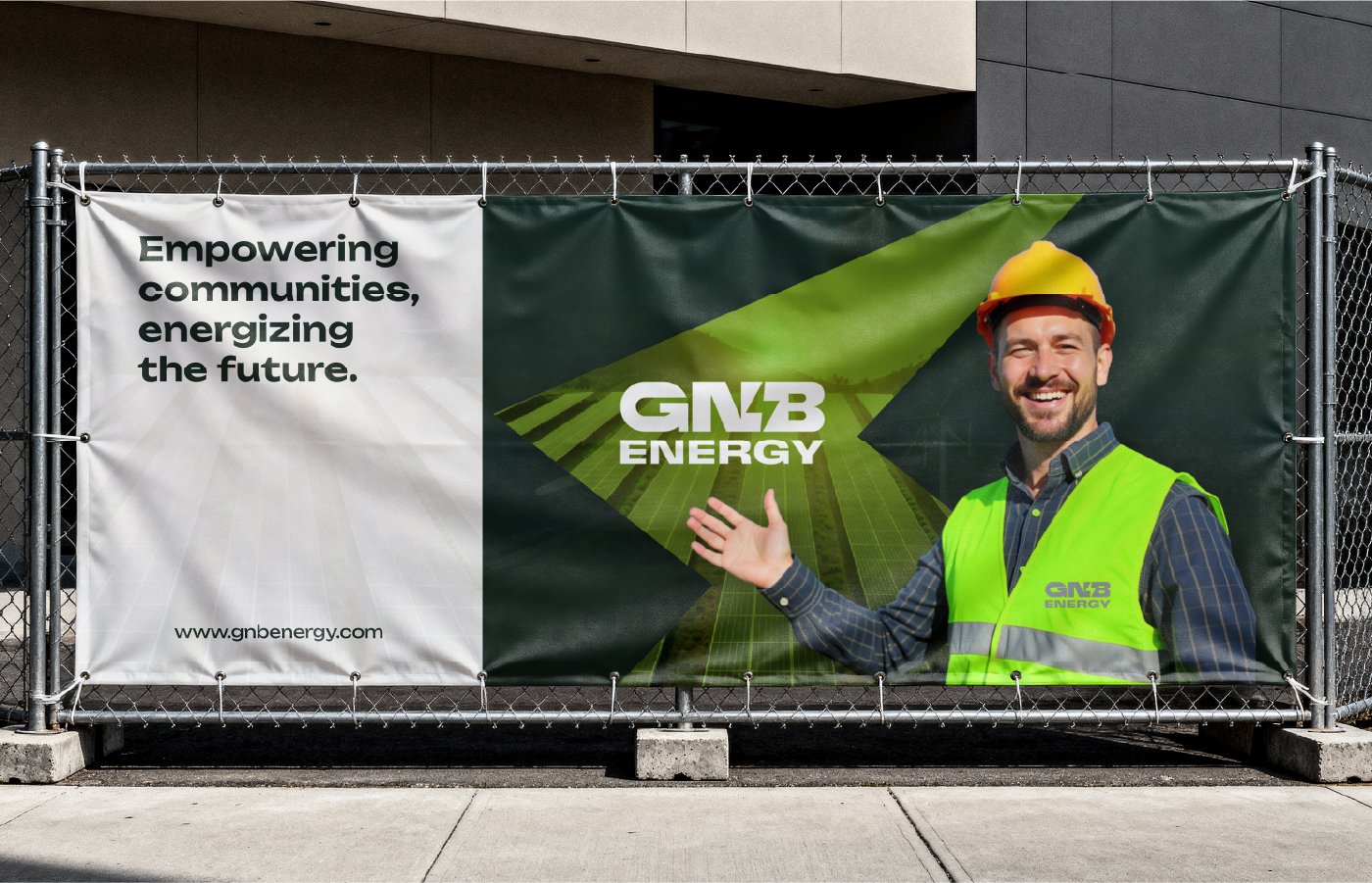
GNB Energy is a forward-thinking energy solutions company focused on providing sustainable power innovations, intelligent energy management systems, and next-generation electrical technologies. The brand identity project aimed to visually communicate the company’s values of efficiency, reliability, sustainability, and technological progress, distinguishing GNB Energy in a competitive and evolving industry.

Branding Goal

The branding goal for GNB Energy was to create a strong, future-ready identity that clearly communicates the company’s purpose, builds trust with its audience, and differentiates it within the competitive energy solutions market. The visual system was designed to be modern, scalable, and consistent across all touchpoints, while reflecting GNB Energy’s core values, technical expertise, and long-term vision.

Brand Challenge

The energy sector, especially in renewables and smart power technologies is highly competitive and visually saturated. GNB Energy needed a brand identity that:

  • Reflects innovation and forward motion

  • Conveys sustainability and environmental awareness

  • Appears professional, modern, and trustworthy

  • Works effectively across digital and physical touchpoints.

The identity had to balance technical authority with approachability, helping the brand stand out to both corporate clients and broader audiences.

Strategic Approach

Creative Strategy & Concept

The core design strategy was rooted in symbolism and modern aesthetics:

Logo Concept

The GNB Energy logo is built around three strategic visual ideas:

  • Typography that conveys power and structure bold and confident to reflect the company’s stability

  • Custom icon integration the letter “G” incorporates an upward arrow, representing energy, progress, growth, and forward motion

  • Dynamic shapes that suggest electricity and innovation

Every aspect of the logo was crafted to visually echo the company’s commitment to technological excellence and sustainable future energy solutions.

Visual Identity System

The visual identity was designed to work consistently across multiple brand assets using these decisions:

Color Palette

Vibrant Green: Represents sustainability, growth, eco-conscious energy solutions

Deep Black / Dark Tones: Signifies strength, technical precision, and trustworthiness

These colors reinforce GNB Energy’s sustainable positioning while maintaining professional authority vital for B2B and corporate sectors.

Typography & Form

  • Bold geometric typography supports clarity and recognition

  • Angular lines and clean shapes align with the theme of innovation and progress

  • Visual angles and forms suggest movement and energy flow, which mirror the company’s core mission

Versatility Across Media

The brand system ensures that the identity translates smoothly into:

  • Business stationery (cards, letterheads)

  • Digital platforms (website, social media)

  • Marketing collateral (brochures, presentations)

  • Environmental branding (signage, office spaces)

This adaptability strengthens brand presence across all touchpoints.

The GNB Energy brand identity achieves the following:

A strong, memorable logo mark that visually conveys energy, growth, and progress
A clear and balanced visual language that blends technical excellence with modern design
An identity system scalable across multiple applications without losing brand essence

Get started now

If you would like to work with us or just want to get in touch, we’d love to hear from you!

London

Baltia Squar, Mark Street, London

New York

Nenuya Centre, Elia Street New York, USA
Email
© 2022 – 2025 | Alrights reserved by codiple